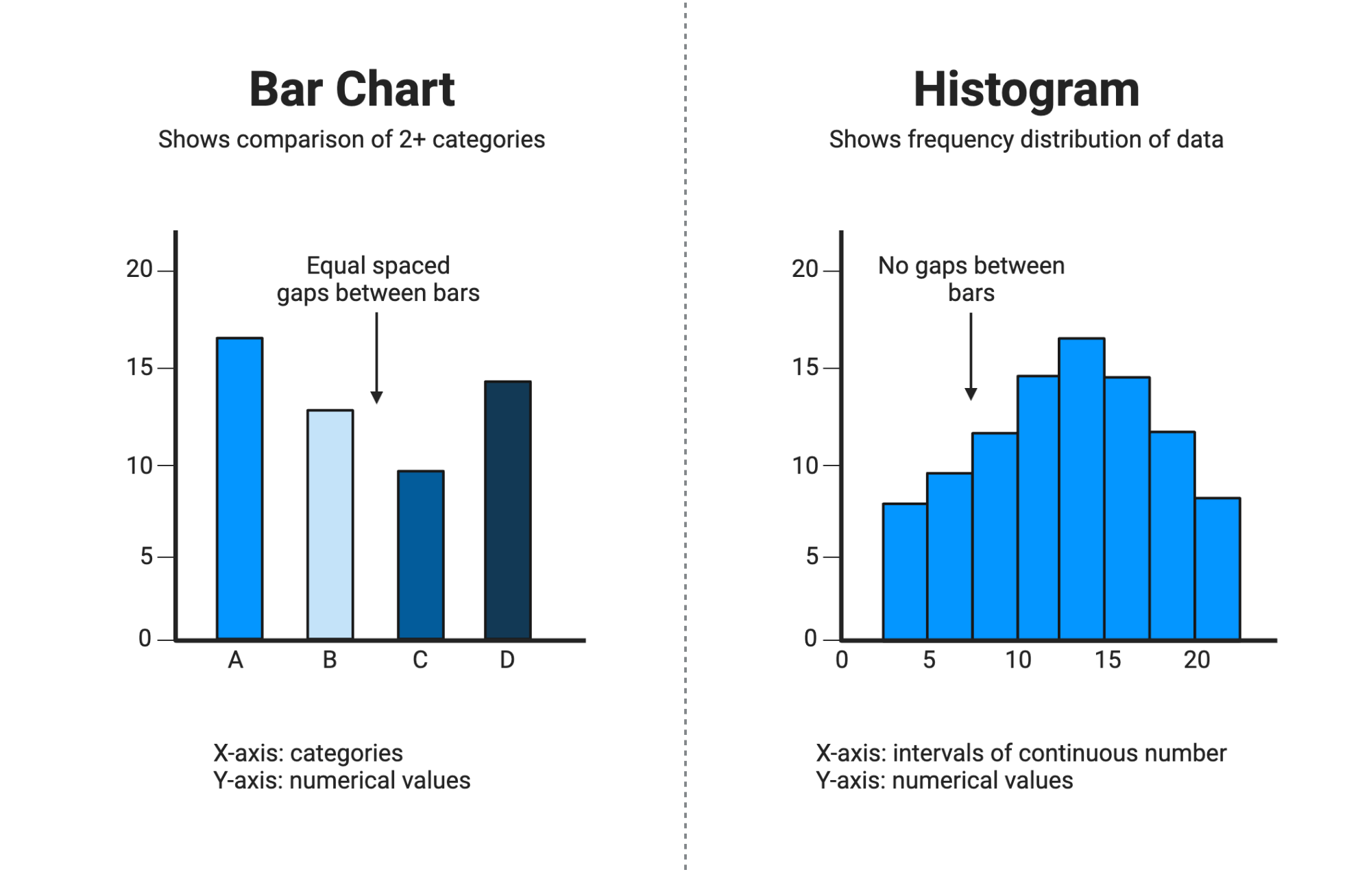
The use of a histogram and barchart in data visualization helps represent data clearly, but knowing the exact distinction between histogram and barchart is essential for selecting the right tool. This article explains the characteristics, differences, and application scenarios for histogram and barchart with clarity and precision.
What is a Histogram?
A histogram is a graphical representation of quantitative data distribution that groups continuous numerical data into bins or intervals. The bars in a histogram are adjacent with no gaps, emphasizing the continuous nature of the data. The height of each bar corresponds to the frequency of data points falling within the specific range. This type of chart is widely used to showcase data distribution, frequency patterns, and central tendency in large datasets. It is particularly useful for analyzing data such as test scores, weights, or time durations.
What is a Barchart?
A barchart (or bar graph) visually represents categorical data, where each bar corresponds to a distinct category or group. Unlike histograms, bars in a barchart are separated by spaces to indicate distinct and unrelated categories. The height of the bar represents the frequency or value for the category it denotes. Barcharts are ideal for comparing values across different groups and are frequently used in business reports, surveys, and qualitative data presentations.
Key Differences Between Histogram and Barchart
| Feature | Histogram | Barchart |
| Data Type | Continuous numerical data | Categorical or discrete data |
| Bar Placement | Bars are adjacent, no gaps | Bars are separated by spaces |
| Bar Width | Widths represent intervals and are usually equal | Widths are uniform and independent of frequency |
| Data Order | Data is ordered by numerical range | Categories can be in any order |
| Usage | Show frequency distribution and data shape | Compare categorical values |
When to Use a Histogram vs a Barchart
You should use a histogram when your data is continuous, numerical, and you are interested in understanding the distribution or spread of the data. Histograms highlight frequency patterns such as skewness, modality, or uniformity. For example, analyzing scores on a test or distribution of weights within a population.
Use a barchart when your data is categorical, and you want a clear comparison of different groups or categories. For example, comparing sales by product type, survey responses by category, or population by region.
How to Read Histograms and Barcharts Effectively
To read a histogram, observe the shape of the distribution formed by the bars. Check for patterns like bell-shaped curves or skewness indicating different data behavior. In contrast, reading a barchart focuses on comparing the height of separate bars to determine which category has higher, lower, or equal values.
FAQs
What is the main advantage of a histogram over a barchart?
A histogram shows the distribution of continuous data across intervals, providing insights into data trends and variation, which a barchart cannot.
Can histogram bars have gaps between them?
No, histogram bars usually do not have gaps because they represent continuous data ranges. Gaps indicate potential data issues or zero-frequency intervals.
Can I use a barchart and histogram for the same dataset?
Yes, but the choice depends on the data type and analysis goal. Use histograms for distribution of continuous data and barcharts for categorical comparisons.
Are the bar widths in histograms always equal?
Typically, yes. Most histograms have bars with equal widths representing equal intervals, but variable-width bins can be used in specific cases.


One thought on “Histogram and Barchart: Understanding Key Differences and Uses”